

BACKGROUND & CONTEXT
OpenCreds, a service developed by the T3 Innovation Network, leverages credentials conforming to the W3C Verifiable Credential (VC) standard to self-issue a VC and enable a third party to write a supporting recommendation to another credential. Open credentials are forms of recognition for skills, knowledge, or achievements earned outside of traditional academic and professional environments.
OpenCreds can be self-issued and cryptographically signed by both the individual claiming skills and the endorser using the LinkedClaims Author service. They do not require either party to have a digital credential wallet or a digital identifier (DID). Rather they require, at a minimum: an email address; a digital storage service, such as Google Drive; access to the internet; and a phone or computer with a contemporary browser to access the service. The goal is to enable anyone to self-author VCs and add credibility to their claims from one or more recommendations. Open credentials can be verified by their issuers and stored locally to be uploaded to accreditation platforms, job applications, personal portfolios, or even social media.
The emergence of verifiable credentials as Learning and Employment Records (LER VCs) issued to learners and workers by institutions, organizations, and employers has given their recipients autonomy and agency to describe what they know and can do directly to anyone. These cryptographically secure awards guarantee the data in them hasn’t been tampered with since it left the issuing platform, and avoid necessitating “phoning home” to confirm their legitimacy. The formats of LER VCs are rapidly expanding, covering certificates, licenses, degrees, transcripts, and dozens of other achievement types, skills, and competencies.
OpenCreds works well for those whose knowledge and abilities are recognized and issued by educational institutions or training providers, or gained on the job and awarded by their supervisors. If skills are the new currency, LER VCs are how they are now digitally written. But there is a start-up problem. Most people today do not have or are likely to receive verifiable credentials to assert their skills. As with any new practice, this is the bootstrapping problem. The majority of learners are not at institutions issuing VCs and it will take time for this deployment to become widespread.
Those with formal diplomas or degrees for completing an educational program, even those with advanced degrees, have their proof of it hanging framed on their walls or stored in a file cabinet. Many others already in the workforce have not had the opportunity to pursue formal education, and therefore have no credentials, paper or otherwise. US Census Bureau data that show more than 62% of the US workforce does not have a degree of any kind. This is likely to continue even as formal training organizations and mid to large-size businesses become credential issuers.
OpenCreds introduces progressive trust to build confidence in self-issued credentials. LER VCs can contain, or be linked to, evidence demonstrating their skill, and assessments supporting them. These linked data are trust anchors which may be located anywhere on the public web, yet preserve the same tamper-evident characteristics of the credentials they describe from URLs connected to hashed content. OpenCreds broadens participation in the future of America’s skill-based workforce. In this evaluation, we sought to understand how people experience and use OpenCreds, an open credential platform that provides verifiable VCs for skills and achievements. We collected data about users’ opinions and priorities regarding open credentials, which OpenCreds can use to adapt their product to real needs.
EVALUATION PURPOSE
The purpose of this evaluation was to explore the overall need and opportunity for a product like OpenCreds, discover how this need changes for members of vulnerable communities, especially STARs (Skilled Through Alternate Routes), and assess the usability of the app in its current state. We have provided OpenCreds with a presentation deck, in addition to this report, that highlights pain points we discovered, including direct user quotes and data visualization graphics, and a list of specific changes that we recommend OpenCreds implement.
STAKEHOLDERS
Karen Passmore, the primary stakeholder, is the director and creator of OpenCreds. She designs the app prototypes and branding.
The U.S. Chamber of Commerce Foundation, a secondary stakeholder, will benefit from the evaluation in that they provided the grant for OpenCreds’ development.
STARs, or workers who are Skilled Through Alternate Routes, are the target user group and secondary stakeholders. These workers may have earned their credentials at institutions other than college, such as trade schools or boot camps. They may have relied on informal, on-the-job training to become qualified for their work. They often come from minority groups or underprivileged backgrounds. This user group will greatly benefit from using OpenCreds, as hiring managers presently tend to overlook workers without college degrees on their résumés. The ownership and validity inherent to open credentials mean that STARs can show the same qualifications as college graduates when applying for jobs.
Employers at small American businesses will interact with OpenCreds differently from the target user group, but they are secondary stakeholders who will benefit from seeing credential metadata when looking to hire qualified employees.
EVALUATION TEAM & CONSTRAINTS
The evaluation was conducted by a four-person team of UX design students from Brigham Young University: Olive Yuen (project manager), Chloë Robinson (writer), Kathryn Mott (Figma designer), and Adam Shumway (data visualization designer). We assessed OpenCreds within the scope of two months, placing a time constraint on the processes involved in the evaluation. The two-month evaluation window may have limited the depth of user research, usability testing, and analysis we could have conducted, especially with unforeseen delays. As students were confined to a specific location, we worked with constrained resources and funds and were unable to reach OpenCreds's full range of target users. However, as a student team, we had the advantage of accessing an academic community of research databases, professors, and frameworks for evaluation. We consulted with pre-career students with unique perspectives on accreditation and workforce entry. Our point of view offered innovative and unbiased recommendations that professionals in the credential business may have overlooked due to industry conventions or routines.
EVALUATION METHODS
The primary goals of our evaluation were to assess the desirability of the OpenCreds solution among the sampled users, test the usability of the digital product for the sampled users, and examine how the desirability and usability of OpenCreds vary based on demographics. To address these goals, we utilized the following methods:
1. Interviews before and after each usability test with the same participants. We interviewed, in total, fourteen participants.
2. Usability tests using two scenarios with two corresponding tasks each. We conducted, in total, fourteen tests.
3. A heuristics analysis where we used common usability heuristics as criteria for assessing the usability of OpenCreds.
4. An accessibility evaluation using WCAG guidelines.
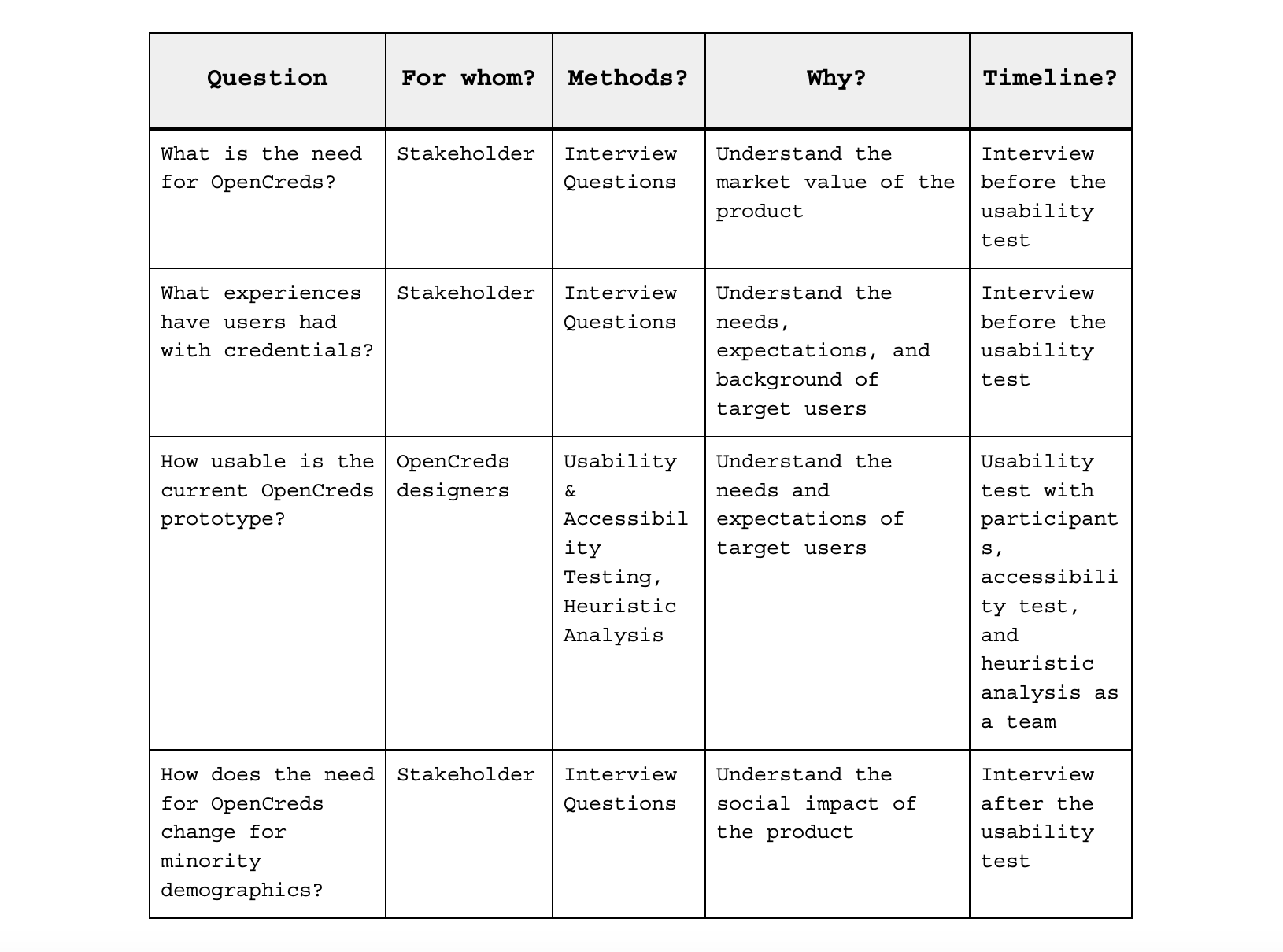
The following table describes our evaluation questions and the methods addressing each question.
SAMPLING
We used a stratified sampling approach, combining convenience and snowball sampling methods. Each team member interviewed at least one user per career phase—pre-career, mid-career, and post-career professionals—as well as at least one employer. Each interviewer included at least one user from a vulnerable community such as STARs (Skilled Through Alternate Routes), ethnic minorities, refugees, individuals with disabilities, or those learning English as a second language. In total, we tested with fourteen users, six of whom identified as members of one or more vulnerable communities.
PRE-TEST INTERVIEW PROTOCOL
Each team member used the following script to interview users before conducting the usability test. We recorded the interviews using Zoom and Loom to later comb for qualitative data. All recordings were transcribed using AI and then proofread by the team. We examined the transcripts to find quantifiable codes and patterns.
Introduction: Thank you for opting to participate in this interview. This session is about testing the tool, not you! Please share any thoughts or reactions you have out loud. We are design evaluators, and you shouldn’t worry about hurting our feelings; we want to hear the good and the bad. Do we have your permission to record this session so we can capture your feedback accurately?
Pre-Test Interview: Before usability testing, we'd like to ask you some questions to see why people might need OpenCreds, how well it works, and how needs differ across demographics.
1. What experiences have you had with credentials/virtual badges?
2. What problems have you faced when job searching?
3. What are the biggest challenges you face when sharing your experience or skills with others?
4. How do you currently share your qualifications with potential employers or clients? What are the limitations of your current methods?
5. What does the phrase “OpenCreds” make you think of? What kind of a product do you think this is?
6. What does the word “skill” make you think of?
POST-TEST INTERVIEW PROTOCOL
Each team member used the following script to interview users after conducting the usability test. We recorded the interviews using Zoom and Loom to later comb for qualitative data. All recordings were transcribed using AI and then proofread by the team. We examined the transcripts to find quantifiable codes and patterns.
Post-Test Interview: The questions asked after the test will allow us to understand how OpenCreds could help the users achieve their goals going forward.
1. What are your overall thoughts about OpenCreds?
2. Would using OpenCreds make any impact on your life? If No, we ask: What would keep you from using it? If Yes, we ask: How would OpenCreds improve your life?
3. In what ways could a digital credential be more useful to you than a traditional degree or certificate?
4. What features or improvements would make OpenCreds more valuable to you?
5. On a scale from 1-10, with 10 being extremely likely, how likely are you to recommend OpenCreds to others? Why?
INTERVIEW DATA
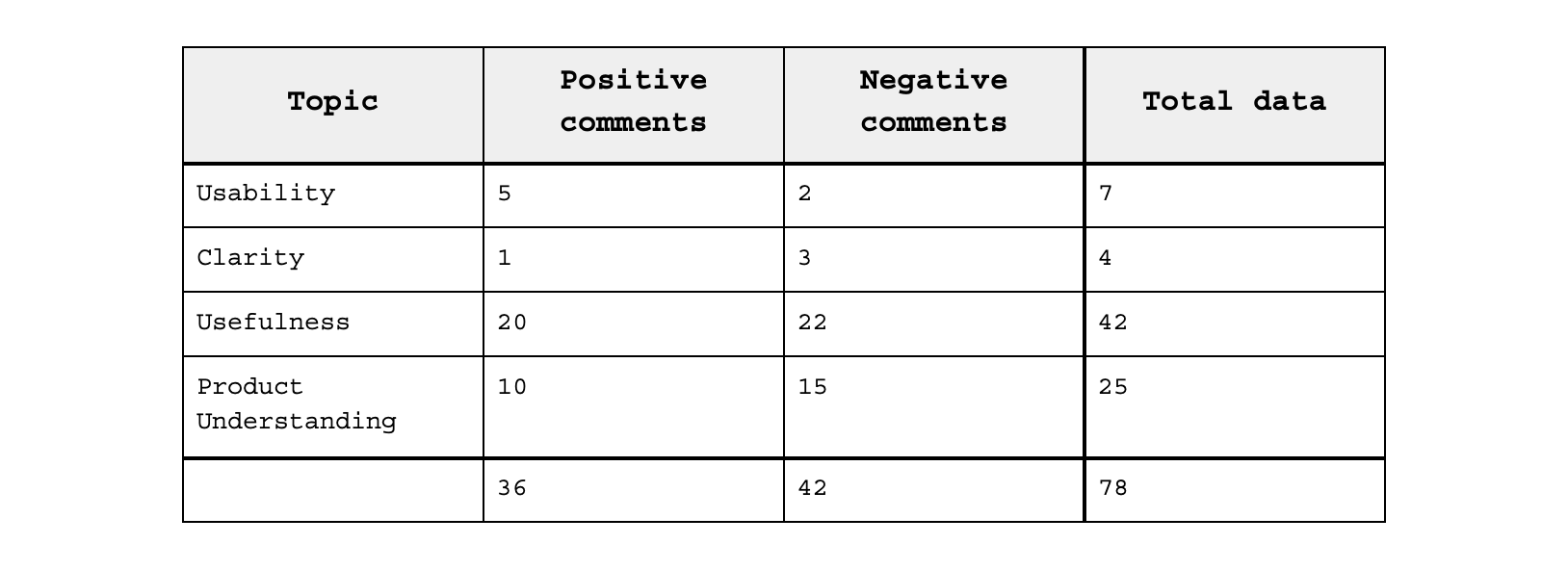
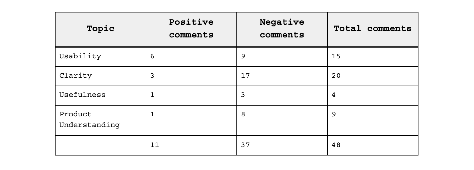
We coded our fourteen interviews for the following four topics: usability, clarity, usefulness, and product understanding. We tagged each comment for one or more of these topics.
1. Usability: the ease with which users navigate through user flows.
2. Clarity: the effectiveness of the product’s text in communicating its purpose.
3. Usefulness: users’ perceived applications for the product
4. Product Understanding: users’ comprehension of OpenCreds’ functionality.
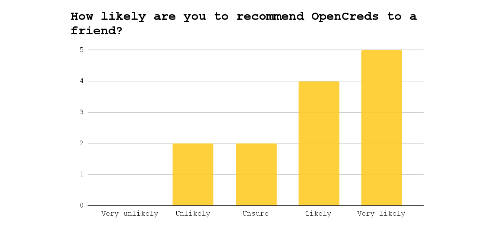
Each of the 61 encoded data points was further classified as either positive (praising aspects of OpenCreds) or negative (criticizing aspects). The following table summarizes the aggregate frequency of each topic and connotation in our interviews. The following graph summarizes the participants’ responses to the question, “How likely are you to recommend OpenCreds to a friend?”
INTERVIEW FINDINGS
Our analysis of the coded data revealed several key insights. Many users misunderstood OpenCreds as a product. Some connected the name “OpenCreds” with university enrollment (“credit hours”) or loan applications (“line of credit”). Anna, a 20-year-old pursuing her real estate license, guessed, “Open credits, with, like, movies?” Some users weren’t familiar with digital badges and didn’t understand the power of creating their credentials. Armando, a 71-year-old STAR and native Spanish speaker, was hesitant about including personal information, asking “[OpenCreds] is a safe platform, right?” Only Sally, a 48-year-old customer service representative, understood that self-authored credentials could be “impressive and more visually impactful for employers… [Open Creds] shows true evidence [and] demonstrates exactly… what you claim you are capable of.”
Non-standardized credentials may not be as communicative and powerful as OpenCreds hopes. Sally dwelled on the functionality of self-authored credentials in her job search, saying, “Without a template… [users] may not key in the right keyword and may not be able to express in text exactly what it's supposed to be.” Lilly, a 22-year-old art history student, had the same insight, foreseeing that “someone might say barista, or someone might say coffee maker, or someone might say bartender” to describe the same set of drink-making skills. She also wondered, “How can you be sure that people are being honest [about their credentials and recommendations]?”
Self-authored credentials weren’t as appealing to users as university degrees. Jeremy, a 49-year-old auditor and employer at an accounting firm, said, “We recruit [employees] on campuses and get applications on Handshake. It's all verified through the universities… The state takes care of licensing accountants. Until the state of Utah changes its education requirements to sit for the CPA exam, I don't see [OpenCreds] being very helpful.” Virginia, a 49-year-old STAR and entrepreneur, said, “I guess [OpenCreds] would show my skill more readily, but it would be limited to just that skill. Whereas if you had a college degree, it would show your critical thinking and other soft skills.” Cassie, a 39-year-old stay-at-home mom, said, "I could see how [OpenCreds] might be useful for somebody who didn't go to college… but I have an MBA, so I'd rather cite that than anything else."
Eight users expressed frustration with job interviews, but only three said the real issue was sharing their skills. Alex, a university student, shared that “a big part of [interviews is] the hiring manager finding out whether or not he can stand you.” Armando lamented that “lots of jobs don’t like to hire older people,” no matter how qualified they may be. Victoria, a 23-year-old STAR and freelance photographer, said that her main frustration is that “there's so many options and little to no organization when it comes to sifting through jobs.” Paulo, a retired salesman of 40+ years, said, “Trying to make [my application] stand out so that I get an interview is a hard, hard thing.” Lena, a foreign immigrant pursuing her career as a dental assistant in the USA, said, “I didn't know how to explain things [in an interview] because English is my second language.” These users recognized OpenCreds as a potentially useful tool but didn’t see how it would address their real problems.
Users didn’t trust that they could create credentials to describe their soft skills. Jeremy said he’ll always rely on face-to-face interviews to assess skills like “presenting [themselves] well, making [me] feel comfortable… and making [me] feel like [I] can trust [them].” Lilly asked, “Is [OpenCreds] only for hard skills? A lot of jobs are looking for soft skills as well, like communication and friendliness or problem-solving. How do you demonstrate [or] provide evidence of that?”
INTERVIEW RECOMMENDATIONS
Based on our interview findings, we recommend the following actions, prioritized from most to least important:
1. Focus on the main pain points. Users expressed their difficulty with job interviews, securing work, and communicating soft skills. OpenCreds should highlight how it potentially addresses these issues.
2. Enhance brand awareness with the product name. Users struggled to understand the name “OpenCreds.” Even in post-test interviews, many were still unclear about its meaning.
USABILITY TESTING PROTOCOL
Each sampled user participated in the usability test between interviews. During the usability test, we observed and noted tasks that users failed to complete the first time, noting the specifics of how the user performed. We also recorded users’ verbal expressions of struggle or dissatisfaction. Usability tests were conducted using the Figma prototypes provided by OpenCreds, with the following two scenarios and their associated tasks guiding the sessions. We recorded the usability tests using Zoom and Loom to later comb for qualitative data. All recordings were transcribed using AI and then proofread by the team.
Scenario 1: You have taken some barista classes and you have some credentials that you’d like to add to your resume for a job application
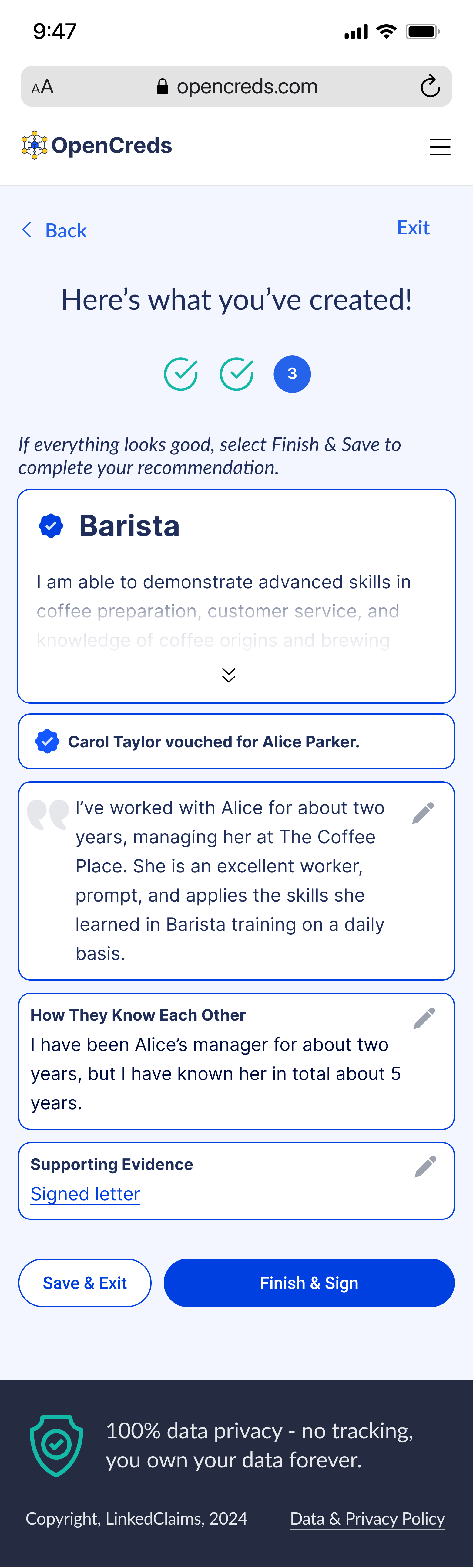
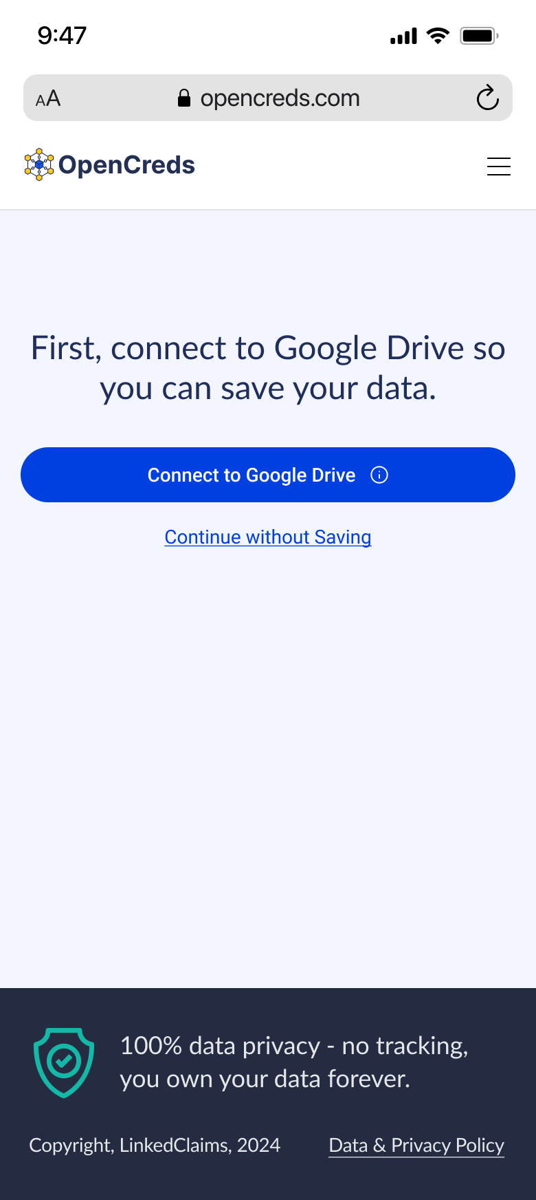
Task 1.1: Create a credential that showcases your barista skills. Some examples of skills you might have learned in these classes include coffee variety knowledge, brewing techniques, latte art techniques, equipment maintenance, etc. We took note of whether users select Google Drive or continue without signing in, reactions to the privacy statement about connecting to Google Drive, whether users read the instructions on the supporting evidence page or skim past it to create links, understanding of the concept of supporting evidence and the different methods for adding, and understanding of the process of adding evidence to a credential as a link or by browsing for files.
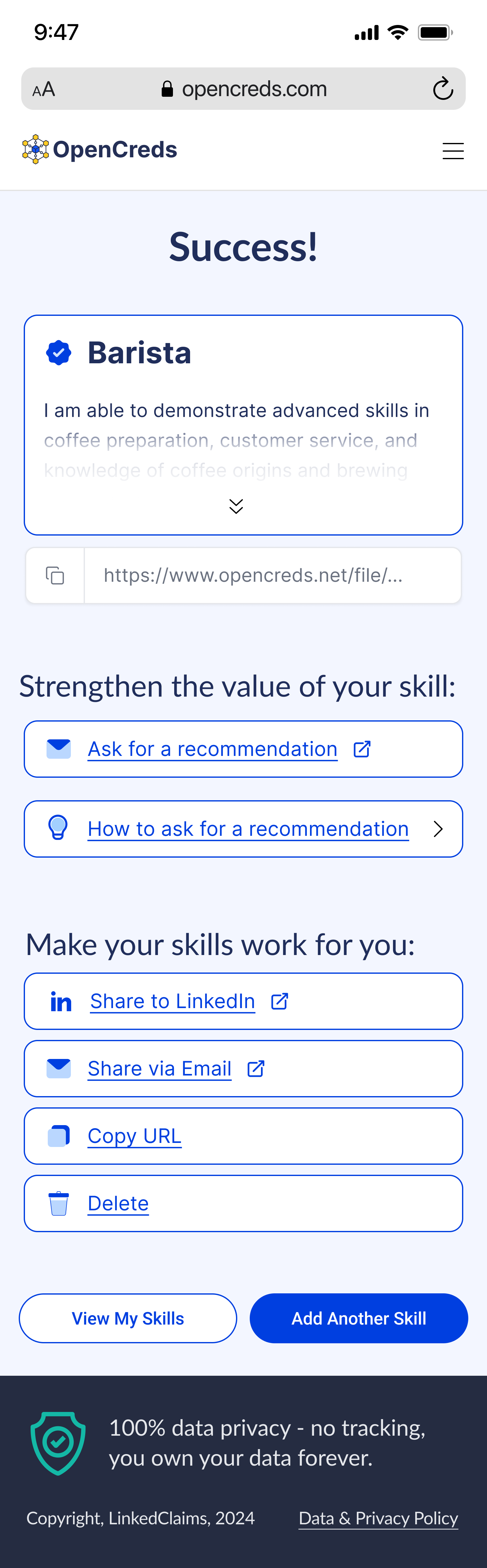
Task 1.2: Get a link to your credential that you can put on a job application to a coffee shop.
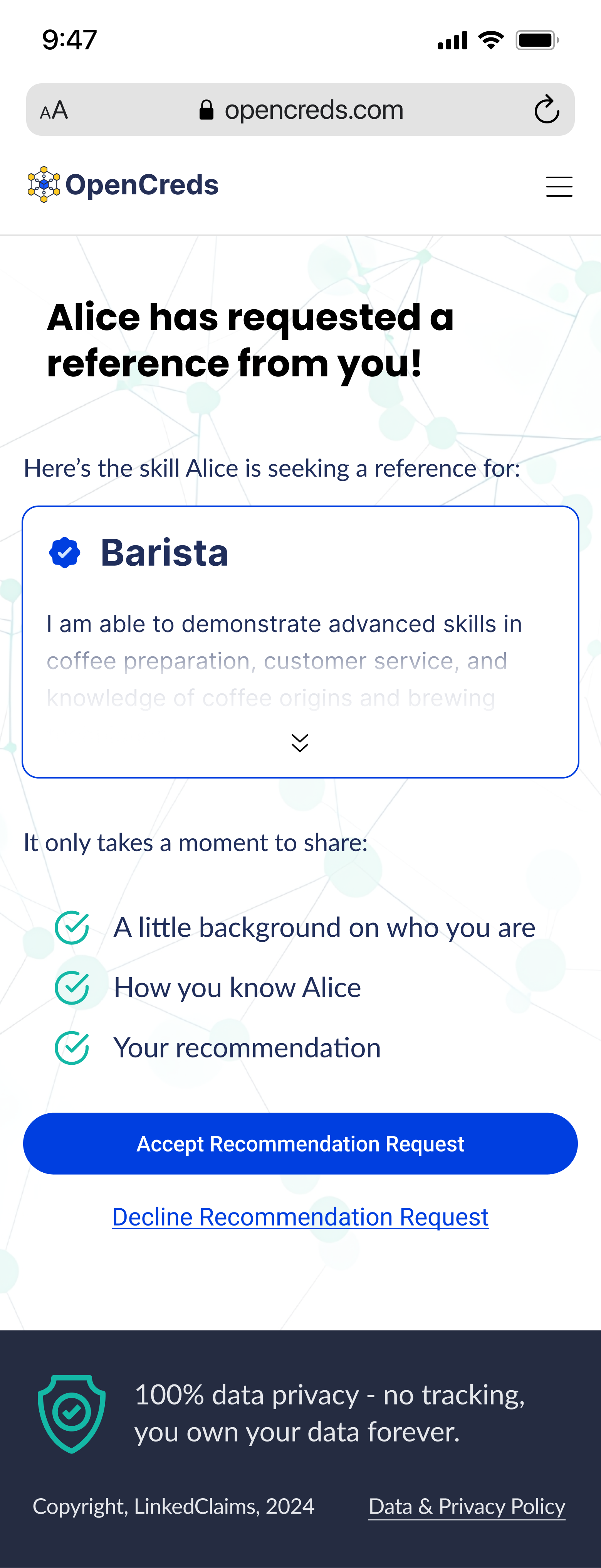
Scenario 2: You were Alice’s mentor in her barista class and she has sent you a reference request.
Task 2.1: Give Alice a good recommendation. We took note of how users reacted to the example text in the text entry field.
Task 2.2: Send the recommendation back to Alice.
USABILITY DATA
We coded our fourteen usability tests for the following four topics: usability, clarity, usefulness, and product understanding. We tagged each comment for one or more of these topics.
1. Usability: the ease with which users navigate through user flows.
2. Clarity: the effectiveness of the product’s text in communicating its purpose.
3. Usefulness: users’ perceived applications for the product
4. Product Understanding: users’ comprehension of OpenCreds’ functionality.
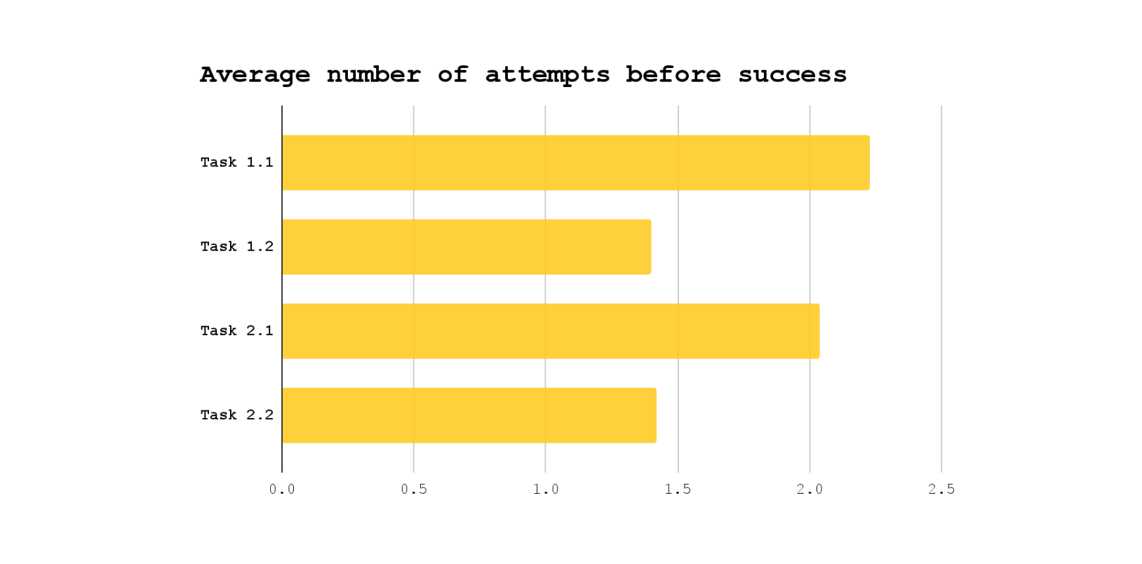
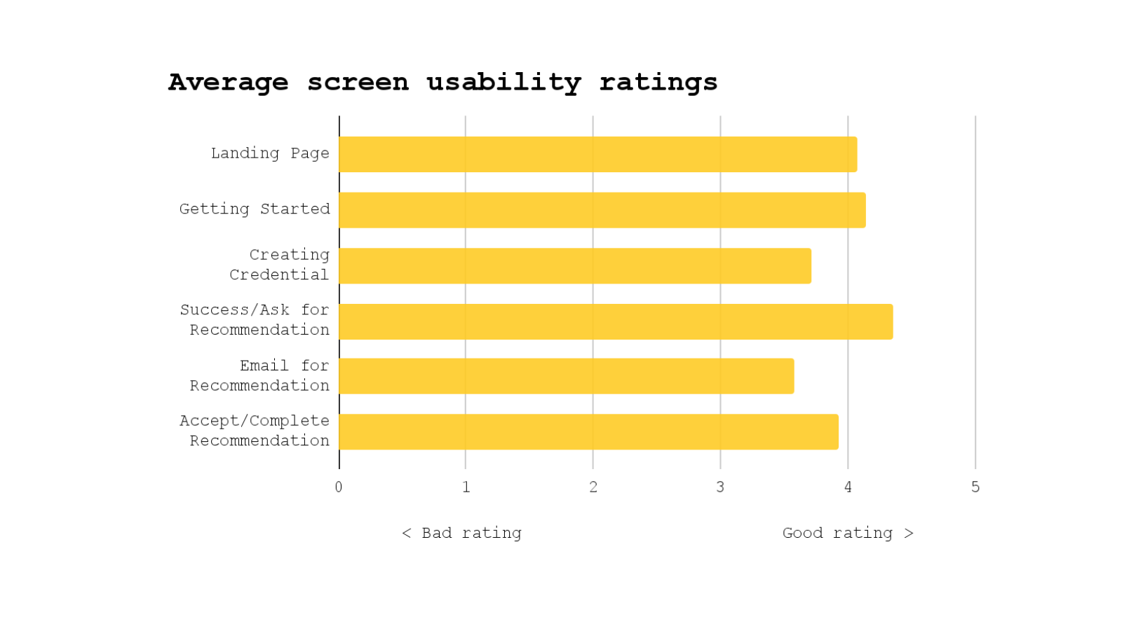
Each of the 35 encoded data points was further classified as either positive (praising aspects of OpenCreds) or negative (criticizing aspects). The following table summarizes the aggregate frequency of each topic and connotation in our usability tests. The following bar chart displays the users’ average number of attempts until their successful completion of the tasks. The ideal number of attempts before success would be one. The next bar chart displays the users’ average responses when asked, “How would you rate the usability of this screen on a scale of 1 to 5, with 5 being extremely usable?” The ideal average rating would be five.
USABILITY TEST FINDINGS
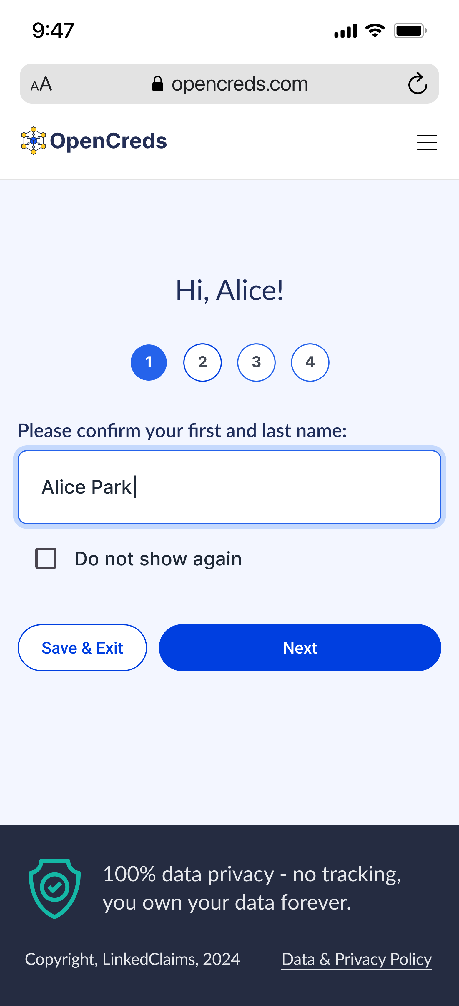
Our analysis of usability testing feedback identified several key areas for improvement. The product lacked clarity in explaining some aspects of credential creation. Lilly, a 22-year-old art history student, said, “‘Do you have any supporting evidence?’ I don’t know what that means.” Virginia, a 49-year-old STAR and entrepreneur, said, “‘Create links by browsing for media.’ So I don’t understand what this does.” Confusion arose regarding the distinction between account creation and credential generation. Upon opening the prototype, Cassie, a 39-year-old stay-at-home mom, wondered, "Is this setting up my account right now or am I making my credential?" Armando, a 71-year-old STAR and native Spanish speaker, asked, “The menu that pops up… I create an account there? How do I connect to Google Drive?”
Users encountered the most usability issues when logging into the Google account. Some participants expressed uncertainty about the need to save progress. Anna, a 20-year-old pursuing her real estate license, said “I’m going to continue without saving, right? Or do I have to continue with Google Drive?” Lilly said, “‘Connect to Google Drive to save your data.’ This is the first time I'm opening the app, and I don't know for sure if I'm going to want to use it. So honestly, continue without saving first.” Cassie asked, "Why do I have to connect my Google Drive? What happens if my Google Drive is full?" Jeremy, a 49-year-old auditor and employer at an accounting firm, said that the Google login flow “wasn’t very obvious.”
Some users misconstrued the prototype as an automated data-filling tool, leading to inflated usability ratings for the creation process. However, those who realized manual input was required were less satisfied with the amount of information needed, especially for skill descriptions. Ryan, a 61-year-old retiree, said “‘Skill description.’ Okay. This feels like a lot of work." Jeremy said, “I would worry if [OpenCreds] becomes popular. Everyone asking me for recommendations would take a lot of typing out… Creating that content would take a lot of time.”
USABILITY RECOMMENDATIONS
Based on our usability test findings, we recommend the following actions, prioritized from most to least important:
1. Increase clarity by cueing users through their flow. Clearer prompts or visual cues could help reduce the ambiguity of the stage within the process.
2. Provide assistance with keywords. Suggesting skill-based keywords for users through AI would further help those less confident in their professional language skills, especially those learning English as a second language.
3. Condense credential creation. Some steps in the credential creation workflow were redundant. For example, the endorsers should only need to review the evidence uploaded by the credential creator, rather than uploading duplicate evidence themselves.
HEURISTIC ANALYSIS DATA
We conducted a heuristic analysis of the prototype after completing interviews and usability tests. Using the design principles outlined in LUMA Institute’s heuristic review, each team member independently rated the prototype on a scale of 1 to 4 (where 1 represents “Poorly Implemented” and 4 represents “Exemplary Implementation”). We selected these Heuristics because they align closely with the evaluation goals for OpenCreds, allowing us to assess the prototype's usability and overall effectiveness. These heuristics are also widely recognized as industry standards for ensuring quality and usability. After completing individual assessments, we compared and discussed our ratings for each heuristic. The analysis concluded with an averaged score for each heuristic, recorded in the table below.
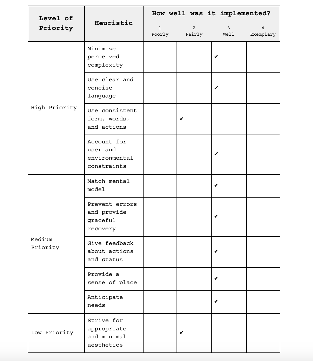
HEURISTIC ANALYSIS FINDINGS
The product effectively anticipates user needs and streamlines the virtual credential creation process. The product successfully gives feedback about users’ actions and status. We observed that the product’s language is consistent between screens.
However, the user interface could be further optimized for improved intuitiveness. However, longer paragraphs and phrases, especially those used in headings, could be more concise. Most of the icons are unlabeled, not recognizable to most users, and belong to different style families (filled, flat, line art, etc.). The content of the hamburger menu varies between screens. It may not even be a necessary button on the landing page. What’s more, the button is positioned on the right, while the menu itself opens from the left side of the screen. In the "create links" section, the same templates are used for both the featured badge image and the user-uploaded image. Using identical templates for different purposes may lead to confusion. The outline around the “add link” box incorrectly suggests a drag-and-drop interaction, which impedes user flow. All clickable text is underlined, creating visual clutter that leads to user confusion.
Also, the product often felt unclear or foreign. We observed that large paragraphs on several pages give the product a sense of complexity. The purpose of the “do not show again” checkbox is unclear. In her usability test, Anna, a 20-year-old pursuing her real estate license, wondered, “When would I ever want to show this again? My name isn't going to change.” Padding and stroke width are inconsistent between screens. The process of connecting to Google Drive—or to different storage platforms, which weren’t options in this prototype—may not be straightforward for all users. There is no tutorial for the process or explanation to help users understand its purpose. The info button on “Connect to Google Drive” is not accessible to mobile users due to its style and placement. There is no option to edit completed credentials or correct errors made in earlier steps, which gives users the sense that they may need to recreate incorrect credentials from scratch. The profile page doesn’t read as the exit from the credential creation flow. This page, especially the area for created credentials, uses many new colors that don’t enhance users’ understanding. The text hierarchy on the “skills” page makes interaction unclear. The “success” page lacks a definite next step.
HEURISTIC RECOMMENDATIONS
Based on our heuristic analysis, we recommend the following actions, prioritized from most to least important:
1. Unify UI and style elements. Inconsistencies in stroke width, padding, icons, and colors across screens were noticeable. Consistent style choices and thoughtful variation could enhance users’ orientation and navigation within the product.
2. Simplify visual hierarchy. The text style and formatting need refinement for a smoother user flow. For instance, underlining all clickable text creates visual clutter and distracts users from their primary tasks. OpenCreds could consider bolding clickable text instead or reducing its font size to establish a clearer visual hierarchy.
3. Create new components for credential creation. In the "create links" section, components incorrectly suggest a drag-and-drop interaction. Recycling components across several screens also contributes to the confusion. Creating new components tailored to specific functions would improve usability.
4. Strengthen text. While the product’s text is concise, it often fails to clarify processes and concepts that make OpenCreds valuable. Definitions should be communicated upfront so users understand the product, its functions, and required actions. Shortening longer paragraphs and headings can enhance flow and readability.
5. Differentiate credentials with pending recommendations. Giving users a status indication of their requested recommendations on the profile page will enhance transparency and facilitate ownership, which are both integral characteristics of OpenCreds.
6. Differentiate user flows. Subtle UI changes should be used to condition the user’s understanding of their place within the app. For example, it’s difficult to distinguish between the profile page and the credential creation pages. Perhaps using different background shades could help make these distinct flows more recognizable.
ACCESSIBILITY TESTING DATA
Our team conducted an accessibility test to ensure the prototype was inclusive and usable for individuals. Using the WCAG Guidelines accessibility checklist and the Stark Figma plugin, we analyzed the provided prototype to pinpoint areas for improvement. The Stark extension helped assess critical aspects such as sufficient color contrast (AAA compliance), logical focus order, adequate control sizes, and alt text for screen reader accessibility. Additionally, we used ChatGPT to evaluate the product’s text readability, ensuring it met an eighth-grade reading level for broader accessibility. The following table summarizes our tests against the WCAG Guidelines, with AAA representing the highest level of compliance and accessibility.
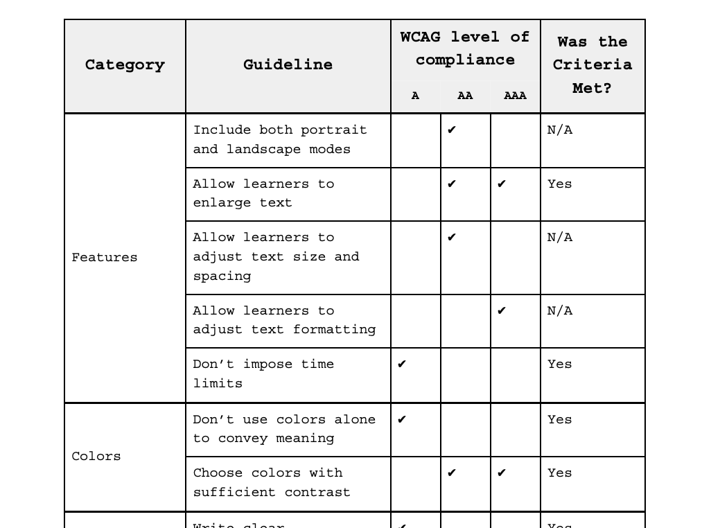
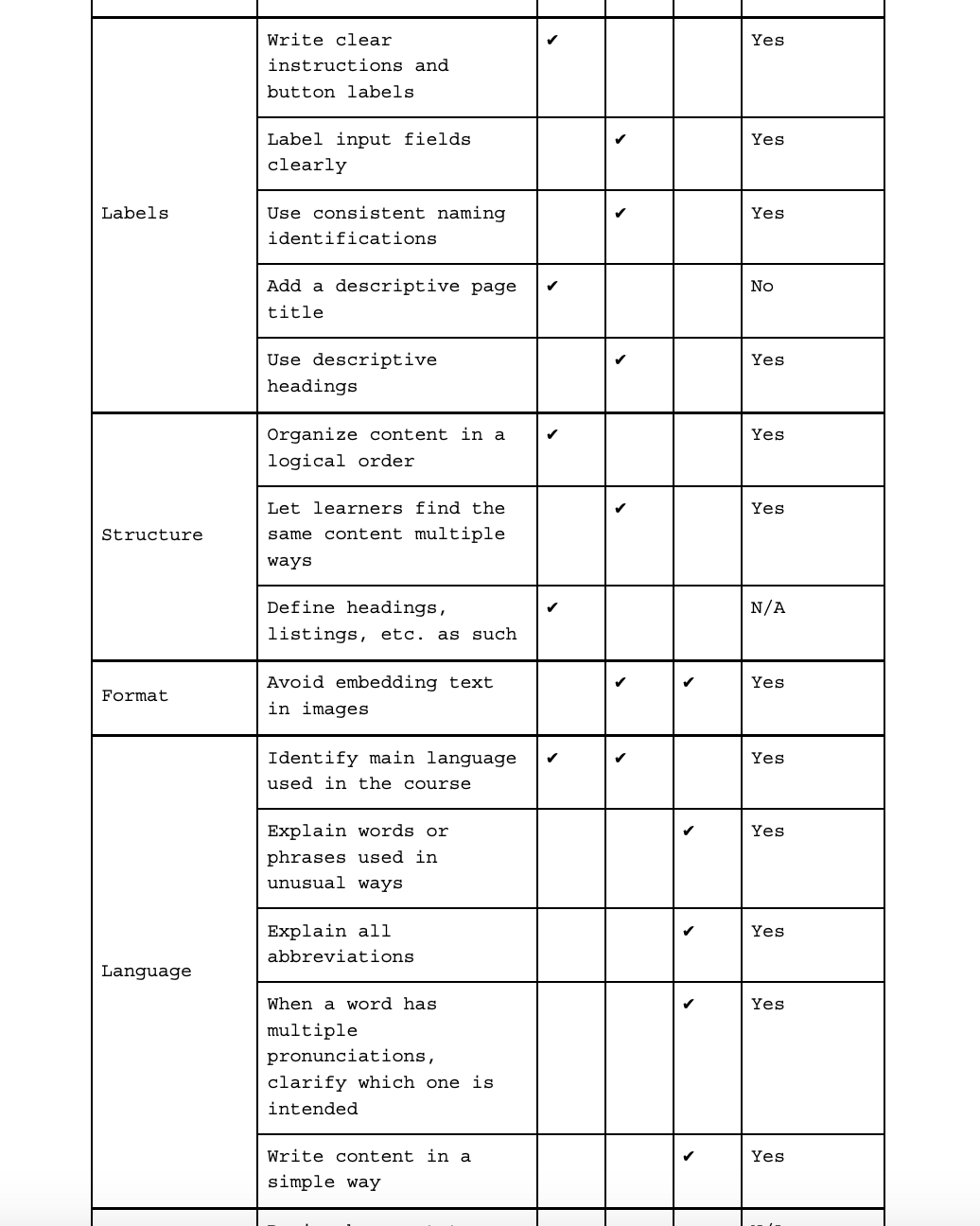
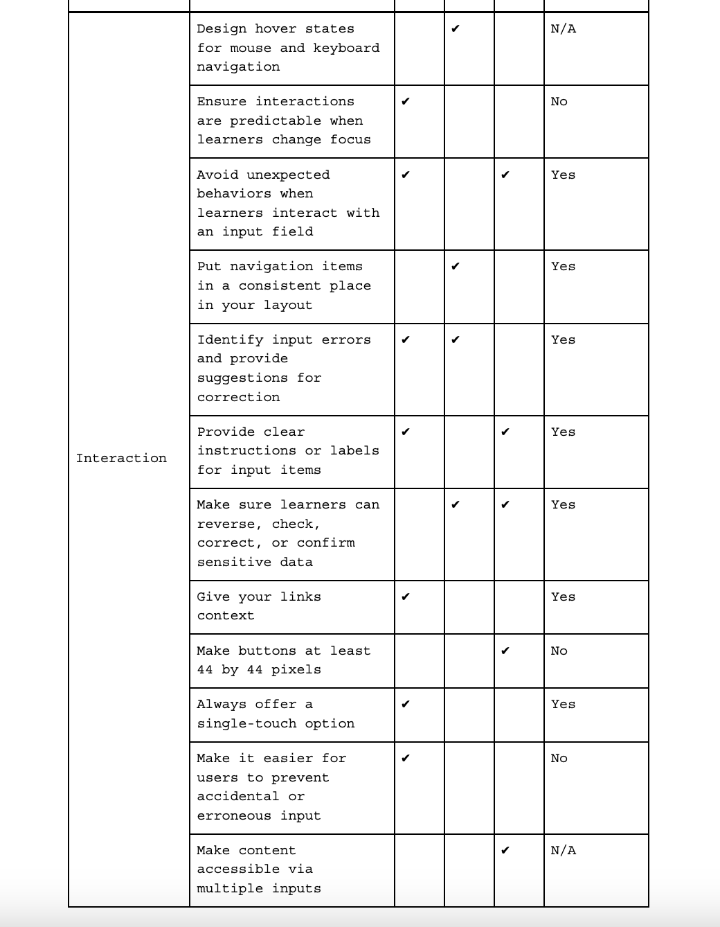
ACCESSIBILITY TEST FINDINGS
The evaluated prototype met some WCAG accessibility standards. However, further refinement of the structural and interaction design components could optimize the user experience. Some areas don’t suggest the type of user interaction they require. For example, the “create links by adding media” button doesn’t look like a button. Also, the prototype failed to meet the Level AAA standard of color contrast. The product’s text readability meets an eighth-grade reading level.
ACCESSIBILITY RECOMMENDATIONS
Based on our accessibility testing, we recommend the following actions, prioritized from most to least important:
1. Standardize clickable buttons. All clickable areas should look like buttons measuring at least 44 by 44 pixels to improve usability, particularly for individuals with motor impairments.
2. Increase color contrast. Enhance color contrast to meet Level AAA so text and visual elements are easily distinguished, especially by individuals with visual impairments. Focus on the contrast between the shades of blue used on buttons and icons.
3. Rework visual cues for clickable areas. Provide clear, consistent visual indicators for clickable elements to cue the correct method of interaction, especially for individuals relying on assistive technologies.
4. Add descriptive page titles. Include meaningful and concise titles on each page to improve navigation, especially for individuals using screen readers.
5. Ensure predictable interactions. Verify that interactions, especially points where learners shift focus between elements, are consistent and predictable, especially by individuals with learning disabilities.
6. Maintain accurate code formatting. Ensure back-end headers, titles, and text are formatted correctly to accommodate individuals using screen readers.
CONCLUSION
The purpose of this evaluation was to explore the overall need and opportunity for a product like OpenCreds, discover how this need changes for members of vulnerable communities, and assess the usability of the app in its current state. OpenCreds effectively anticipates user needs, streamlines the virtual credential creation process, and meets the highest-priority WCAG standards. However, our evaluation revealed multiple opportunities to optimize the product for clarity, usability, and product understanding. Some participants expressed confusion about the need to save progress and create an account. Many participants either misunderstood what OpenCreds is or misread its capabilities. They recognized OpenCreds as a potentially useful tool but didn’t see its value in addressing problems they face when applying for jobs. Some participants misconstrued the prototype as an automated credential generator, leading to inflated usability ratings for the creation process. However, those who realized manual input is required were less satisfied with the process of creating skill descriptions. Further refinement of structural and interaction design components could optimize the user experience.
ALL RECOMMENDATIONS
The following recommendations for OpenCreds are aggregated from our four testing methods and prioritized from most to least important:
1. Standardize clickable buttons. All clickable areas should look like buttons measuring at least 44 by 44 pixels to improve usability, particularly for individuals with motor impairments.
2. Focus on the main pain points. Users expressed their difficulty with job interviews, securing work, and communicating soft skills. OpenCreds should highlight how it potentially addresses these issues.
3. Increase clarity by cueing users through their flow. Clearer prompts or visual cues could help reduce the ambiguity of navigation within the process.
4. Provide assistance with keywords. Suggesting skill-based keywords for users through AI would further help those less confident in their professional language skills, especially those learning English as a second language.
5. Condense credential creation. Some steps in the credential creation workflow were redundant. For example, the endorsers should only need to review the evidence uploaded by the credential creator, rather than uploading duplicate evidence themselves.
6. Increase color contrast. Enhance color contrast to meet WCAG Level AAA so text and visual elements are easily distinguished, especially by individuals with visual impairments. Focus on the contrast between the shades of blue used on buttons and icons.
7. Unify UI and style elements. Inconsistencies in stroke width, padding, icons, and colors across screens were noticeable. Consistent style choices and thoughtful variation could enhance users’ orientation and navigation within the product.
8. Simplify visual hierarchy. The text style and formatting need refinement for a smoother user flow. For instance, underlining all clickable elements creates visual clutter and distracts users from their primary tasks. OpenCreds could consider bolding clickable text instead or reducing its font size to establish a clearer visual hierarchy.
9. Rework visual cues for clickable areas. Provide clear, consistent visual indicators for clickable elements to cue the correct method of interaction, especially for individuals relying on assistive technologies.
10. Create new components for adding evidence. In the "create links" section, components incorrectly suggest a drag-and-drop interaction. Recycling components across several screens also contributes to the confusion. Creating new components tailored to specific functions would improve usability.
11. Strengthen text. While the product’s text is concise, it often lacks clarity and descriptiveness. Definitions should be communicated upfront so users understand the product, its functions, and required actions. Shortening longer paragraphs and headings can enhance flow and readability.
12. Add descriptive page titles. Include meaningful and concise titles on each page to improve navigation, especially for individuals using screen readers.
13. Ensure predictable interactions. Verify that interactions, especially points where learners shift focus between elements, are consistent and predictable, especially by individuals with learning disabilities.
14. Differentiate credentials with pending recommendations. Giving users a status indication of their requested recommendations on the profile page will enhance transparency and facilitate ownership, which are both integral characteristics of OpenCreds.
15. Differentiate user flows. Subtle UI changes should be used to condition the user’s understanding of their place within the app. For example, it’s difficult to distinguish between the profile page and the credential creation pages. Perhaps using different background shades could help make these distinct flows more recognizable.
16. Enhance brand awareness with the product name. Users struggled to understand the name “OpenCreds.” Even in post-test interviews, many were still unclear about its meaning.
17. Maintain accurate code formatting. Ensure back-end headers, titles, and text are formatted correctly to accommodate individuals using screen readers.